As we’ve discussed before, PDF files can contain a whole bunch of different fonts, but in the end most of them come down to two categories – Type 1 based formats, and TrueType based formats.
All of the formats our font converter generates are OpenType based, which allows you to use either Type 1 glyphs or TrueType glyphs. A few other services like ours always convert the glyphs to TrueType, but we prefer to keep them as close to their original form as possible. Here’s why.
1. Cubic > Quadratic
TrueType glyphs consist of quadratic Bézier curves, while type 1 glyphs use cubic Bézier curves. Quadratic curves have a start and end point and one control point, whereas cubic curves have an extra second control point.
Crucially, it’s possible to perfectly represent quadratic curves using cubic curves, but not the other way around, meaning converting to quadratic curves is an inherently lossy process.
2. Hinting differences
Another important difference between Type 1 and TrueType glyphs is their hinting formats.
TrueType glyphs feature a complex instruction based system for hinting which lets you write small programs which can move the points of each glyph around based on their size on-screen and more.
Type 1 uses a declarative approach, where you tell the interpreter a few things about the glyph and leave it to work out how to render it on its own.
While it is possible to create software to write TrueType hinting programs based on these declared hints, it’s both complex and, again, lossy. TrueType fonts which have automatically generated hinting are very poorly regarded.
3. It’s 2014!
There’s still a bit of a myth that browsers have better support for TrueType glyphs than Type 1. This hasn’t really been true for several years. While the tools for working with Type 1 based OpenType fonts still lag behind, the browsers have more or less caught up. (Chrome is due to add sub-pixel rendering on Type 1 glyphs on Windows any day now.)
How does our font converter compare?

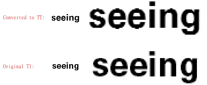
Here’s an example of how converted glyphs look compared to our Type 1 glyphs. Note the difference between the top and bottom of the ‘s’ in the TrueType rendering – the bottom looks flat, while the top has an odd bump. Also note the straight flat baseline of the Type 1 line compared to the drooping ‘e’s in the TrueType rendering.
Keeping glyphs as close to their original format is really the only way to keep fonts looking how their designers intended – we think it’s worth the effort.
Our software libraries allow you to
| Convert PDF files to HTML |
| Use PDF Forms in a web browser |
| Convert PDF Documents to an image |
| Work with PDF Documents in Java |
| Read and write HEIC and other Image formats in Java |