
In the early days of fonts, each glyph was stored as a bitmap at a range of sizes. Drawing it was a simple case of picking the right sized image of the glyph and putting it on the screen. This let designers add and remove details at various sizes to make the text readable.


Most fonts are now stored as outlines which can be easily scaled. This means fonts can be rendered at any size, but without additional features it also would mean that the font’s designer has very little control over how the font appears at different sizes. You’d be presented with a choice: add details which look great when displayed at larger sizes, of lose out on the details so that they don’t confuse the glyph at lower sizes. Even with simple outlines it can be hard for font renderers to know which pixels should be ‘on’ and which should be ‘off’. The standard way of choosing should be on is whether the centre is inside the glyph outline, but this can cause some pretty big problems:
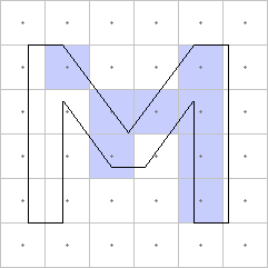
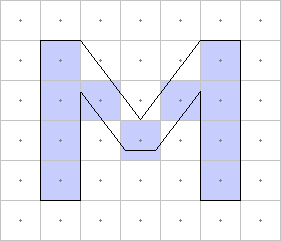
Luckily, that’s where hinting – otherwise (and perhaps more helpfully) known as grid fitting – comes in. There are three methods font technologies use for this, but both would end up with something like this:
Of course, it’s all a little more complex than this these days, since most font renderers now use anti-aliasing and sub-pixel rendering. (I won’t go into that here, but it’s pretty cool.) So, the three methods:
Automated Hinting
Some font renderers are now so good at guessing how a glyph should look at certain sizes that they ignore any hinting data provided entirely. This is particularly noticeable on OSX.
Descriptive Hinting
PostScript fonts use values to describe typical features of the font, and then add operators into the glyph description which tells the renderer where stems are. The renderer then uses this information to render the glyphs as well as it can, keeping stems solid and separate, making sure the bottoms and tops of glyphs line up, and making curves appear rounded if possible and flat if not.
Instructed Hinting
TrueType hints come in the form of little programs which move the points around based on the point size and resolution. This allows the designer complete control over how the outlines react to different sizes. This system has also been used by some fonts to construct new glyphs by combining other glyphs which are just brush strokes and then shifting and reshaping them. We’ve even got a video of that all happening in our very own TrueType hinting debugger.
We’ve been working hard to make sure that all of our converted fonts have good hinting data so that they’ll look great in browsers. Why not try it out and see what it can do?