TL;DR
- What it is: A process (also called grid fitting) that uses instructions to align scalable font outlines to a display’s pixel grid.
- Why it’s needed: Prevents distortion and blurring, ensuring legibility when fonts are rendered at small sizes or low resolutions.
- How it works: Achieved via three main methods: Automated, Descriptive (PostScript), or Instructed (TrueType programs).
What is Font Hinting?
Font hinting (also known as grid-fitting) is the use of mathematical instructions to adjust the display of an outline font so that it lines up with a rasterized grid. At small sizes, this ensures that pixels are turned ‘on’ or ‘off’ in a way that preserves legibility and consistency.
This process is essential for ensuring maximum legibility, especially at small sizes or lower screen resolutions, by forcing consistent stem widths and horizontal alignments. It translates the scalable mathematical description of a font into a crisp, readable arrangement of screen pixels.
History
In the early days of fonts, each glyph was stored as a bitmap at a range of sizes. Drawing it was a simple case of picking the right sized image of the glyph and putting it on the screen. This let designers add and remove details at various sizes to make the text readable.

Most fonts are now stored as outlines which can be easily scaled. This means fonts can be rendered at any size, but without additional features it also would mean that the font’s designer has very little control over how the font appears at different sizes.
You’d be presented with a choice: add details which look great when displayed at larger sizes, of lose out on the details so that they don’t confuse the glyph at lower sizes.
Why Grid-Fitting is Required (The Mechanism)
Even with simple outlines it can be hard for font renderers to know which pixels should be ‘on’ and which should be ‘off’. The standard way of choosing should be on is whether the centre is inside the glyph outline. This is often referred to as the “center-of-pixel rule.”
As illustrated below, applying the center-of-pixel rule to an outline without hinting can cause severe distortion:
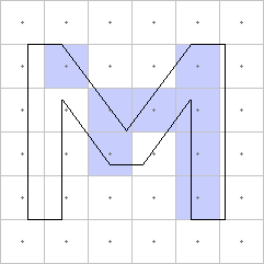
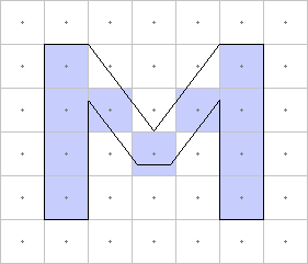
This distortion occurs because the edges of the vector outline fall between pixels. Hinting resolves this by literally moving the vector points to snap and align features (like the vertical stems of an ‘M’) precisely to the pixel grid before the center-of-pixel rule is applied.
Of course, it’s all a little more complex than this these days, since most font renderers now use anti-aliasing and sub-pixel rendering. (I won’t go into that here, but it’s pretty cool.)
The Three Methods of Font Hinting
Automated Hinting
Some font renderers are now so good at guessing how a glyph should look at certain sizes that they ignore any hinting data provided entirely. This is particularly noticeable on OSX.
Descriptive Hinting
PostScript fonts use values to describe typical features of the font, and then add operators into the glyph description which tells the renderer where stems are.
The renderer then uses this information to render the glyphs as well as it can, keeping stems solid and separate, making sure the bottoms and tops of glyphs line up, and making curves appear rounded if possible and flat if not.
Instructed Hinting
TrueType hints come in the form of little programs which move the points around based on the point size and resolution. This allows the designer complete control over how the outlines react to different sizes.
This system has also been used by some fonts to construct new glyphs by combining other glyphs which are just brush strokes and then shifting and reshaping them.
| Method | Font Technology | Description |
|---|---|---|
| Automated Hinting | All (renderer-dependent) | Renderer ignores font data and algorithmically guesses glyph appearance. Common on macOS. |
| Descriptive Hinting | PostScript/CFF | Font provides values describing features (stems, alignment zones). Renderer interprets to optimize display. |
| Instructed Hinting | TrueType/OpenType-TT | Embedded programs dynamically move points based on size and resolution. Complete designer control. |
TrueType Hinting Debugger
We’ve even got a video of that all happening in our very own TrueType hinting debugger:
We’ve been working hard to make sure that all of our converted fonts have good hinting data so that they’ll look great in browsers. Why not try it out and see what it can do?
FAQs
Q: What is the difference between Font Hinting and Anti-Aliasing?
A: Hinting adjusts the font’s vector outline to align with the pixel grid (defines the shape). Anti-aliasing uses shades of grey/colour to smooth the final pixel edges (smoothes the curves).
Q: Is font hinting still necessary on modern High-DPI (Retina) screens?
A: It is less critical on high-resolution screens because pixels are smaller. However, it remains important for optimal consistency on standard monitors, older devices, and e-readers.
Q: What is Sub-Pixel Rendering?
A: An advanced anti-aliasing technique that uses the individual red, green, and blue (RGB) sub-strips within each LCD pixel. This effectively triples the horizontal resolution, significantly improving text sharpness.
Our software libraries allow you to
| Convert PDF files to HTML |
| Use PDF Forms in a web browser |
| Convert PDF Documents to an image |
| Work with PDF Documents in Java |
| Read and write HEIC and other Image formats in Java |
At last! NOW I know what Font Hinting is! Great, interesting and easy to read article. Thank you very much!
Thank you. I needed to figure out if I want it on or off. Turns out, for now, I’m trying it off given the resolution of the computer in question. If it turns out something is unreadable when small, I know exactly what to turn back on!