Introduction
One of the aims of BuildVu and all of it’s various view modes (all 9 of them) was to make viewing of PDF files easy and platform independent; where the user only needs a relatively modern web browser to view them.
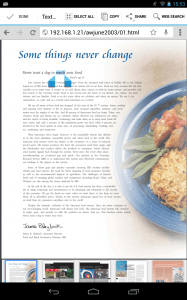
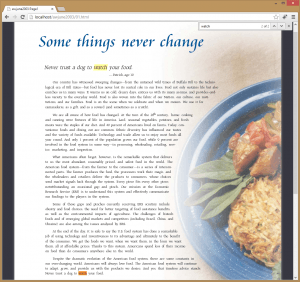
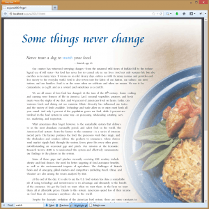
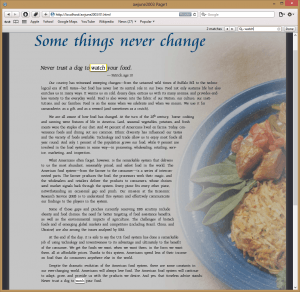
And as we designed the output to be used by the browser we also allow you to select and search the text using your browser’s default tools, and this free functionality normally works great in all web browsers, across all platforms, even Android devices as you can see in the images in this post.
Issue on iOS Browsers

However this sadly isn’t true within Apple’s current version of Safari on iOS and Chrome on the iOS. Currently both don’t quite support all the latest CSS to as great a degree as other mobile devices and as a result of it’s bizarre Selection engine it’s very difficult and often impossible to select text on pages containing complicated CSS (explained below).
We recently had a customer query us about why they couldn’t select the text of our output on their iPad which struck us as an odd question; the default mode for our output has had selectable text for as long as I can recall so my initial thought was that it may of just been a user unfamiliar with how to select text on an iPad. However we still checked to be sure and were surprised to find that the text wasn’t selectable.
This was puzzling because, as I before mentioned, the text has always been selectable, it is after all just text within a div tag in the HTML and we were sure it worked previously.

Investigating the Problem
After going over our current output I found some older output that worked and had a look at the differences to the current version.
Visually they looked almost identical with a few improvements in regards to character spacing in our current version and a different background colour.
Structurally the newer version differs quite a lot from the older version. In our older versions we placed the text within div tags under our parent jpedal tag with styling like so:
<body style="background-color: rgb(55,55,65);">

<div id="jpedal" style="position:relative; width: 984px; margin: 0 auto;">


<!– Shared CSS values –>

<style type="text/css" >

.t {

position:absolute;

white-space:nowrap;

overflow:visible;

z-index:1;

}


.tr {

-webkit-transform-origin: left top;

-ms-transform-origin: left top;

-moz-transform-origin: left top;

-o-transform-origin: left top;

}

</style>


<!– Inline CSS values –>

<style type="text/css" >


#t1_1 {

left:90px;

top:60px;

FONT-SIZE: 60px;

FONT-FAMILY: CataneoBT-Regular1;

color:rgb(0,85,149);

}


#t2_1 {

-webkit-transform:matrix(0.97,0,-0.2,0.97,114, 181);

-ms-transform:matrix(0.97,0,-0.2,0.97,114, 181);

-moz-transform:matrix(0.97,0,-0.2,0.97,114, 181);

-o-transform:matrix(0.97,0,-0.2,0.97,114, 181);

FONT-SIZE: 21px;

FONT-FAMILY: IGNACK-RaleighBT-Roman1;

color:rgb(35,32,32);

}


#t3_1 {

-webkit-transform:matrix(0.97,0,-0.2,0.97,350, 212);

-ms-transform:matrix(0.97,0,-0.2,0.97,350, 212);

-moz-transform:matrix(0.97,0,-0.2,0.97,350, 212);

-o-transform:matrix(0.97,0,-0.2,0.97,350, 212);

FONT-SIZE: 13px;

FONT-FAMILY: IGNACK-RaleighBT-Roman1;

color:rgb(35,32,32);

}

</style>


<!– Any embedded fonts defined here –>

<style type="text/css" >

@font-face {

font-family: CataneoBT-Regular1;

src: url("01/fonts/CataneoBT-Regular.woff");

}


@font-face {

font-family: IGNACK-RaleighBT-Roman1;

src: url("01/fonts/IGNACK-RaleighBT-Roman.woff");

}

</style>


<!– Text defined here and setup in CSS –>

<div id="t1_1″ class="t">Some things never change</div>

<div id="t2_1″ class="t tr">Never trust a dog to watch your food.</div>

<div id="t3_1″ class="t tr">â��</div>

We simply apply the correct styling and letter spacing to each element via it’s class and ID attributes.
Introduction of Parent Divs
To reduce the large amount of class=”t” which is a CSS class in our older output that contained some CSS rules common to all of our text and other repeated values in the CSS for each div’s ID we introduced several parent divs, that reduce file size and make our CSS easier to understand.
Example of Current Output
Below you can see an example of the current output and it’s structure (Note: As with the previous example this is just a snippet of the relevant parts of our output):
<body style="background-color:#919191;">

<div id="jpedal" style="position:relative; width: 984px; height: 1179px; overflow: hidden; margin: 0 auto; box-shadow: 0 2px 6px rgba(100, 100, 100, 0.5);">


<!– Begin shared CSS values –>

<!–[if lt IE 9]><style type="text/css">.text div div{zoom: 25%;}</style><![endif]–>

<style type="text/css" >

.text {

position: absolute;

-webkit-transform-origin: top left;

-moz-transform-origin: top left;

-o-transform-origin: top left;

-ms-transform-origin: top left;

-webkit-transform: scale(0.25);

-moz-transform: scale(0.25);

-o-transform: scale(0.25);

-ms-transform: scale(0.25);

z-index: 1;

}

.text div div {

position:absolute;

white-space:nowrap;

overflow:visible;

}

</style>

<!– End shared CSS values –>


<!– Begin inline CSS –>

<style type="text/css" >


#t1_1{left:360px;top:240px;}

#t2_1{-webkit-transform:matrix(0.97,0,-0.2,0.97,456, 724);-ms-transform:matrix(0.97,0,-0.2,0.97,456, 724);-moz-transform:matrix(0.97,0,-0.2,0.97,456, 724);-o-transform:matrix(0.97,0,-0.2,0.97,456, 724);}

#t3_1{-webkit-transform:matrix(0.97,0,-0.2,0.97,1400, 848);-ms-transform:matrix(0.97,0,-0.2,0.97,1400, 848);-moz-transform:matrix(0.97,0,-0.2,0.97,1400, 848);-o-transform:matrix(0.97,0,-0.2,0.97,1400, 848);}

#t4_1{left:1456px;top:848px;}


#t2_1,#t3_1 {

-webkit-transform-origin: left top;

-ms-transform-origin: left top;

-moz-transform-origin: left top;

-o-transform-origin: left top;

}


.s2_1{

FONT-SIZE: 84px;

FONT-FAMILY: IGNACK-RaleighBT-Roman1;

color: rgb(35,32,32);

}


.s1_1{

FONT-SIZE: 240px;

FONT-FAMILY: CataneoBT-Regular1;

color: rgb(0,85,149);

}


.s3_1{

FONT-SIZE: 52px;

FONT-FAMILY: IGNACK-RaleighBT-Roman1;

color: rgb(35,32,32);

}


</style>

<!– End inline CSS –>


<!– Begin embedded font definitions –>

<style type="text/css" >


@font-face {

font-family: CataneoBT-Regular1;

src: url("index/fonts/CataneoBT-Regular.woff");

}


@font-face {

font-family: IGNACK-RaleighBT-Roman1;

src: url("index/fonts/IGNACK-RaleighBT-Roman.woff");

}


</style>

<!– End embedded font definitions –>


<!– Begin text definitions (Positioned/styled in CSS) –>

<div class="text">

<div class="s1_1″>

<div id="t1_1″>Some things never change</div>

</div>

<div class="s2_1″>

<div id="t2_1″>Never trust a dog to watch your food.</div>

</div>

<div class="s3_1″>

<div id="t3_1″>â��</div>

This reduced our output length by a lot; not having to output the font-family per id and the class=”t” per element adds up to a lot of saved characters in the output files which consequently makes large converted files with a lot of similar text smaller.
However nesting these absolutely positioned elements appears to be what the issue is in iOS. This probably isn’t intended behaviour and may well be a bug with iOS!
Workaround and Conclusion
One solution we’ve come up with for this is to change the output on the page when navigated to in iOS to something it can select the text of. Of course this effects the performance of our output when looked at on iOS devices which isn’t the best compromise.
My personal hope is that this issue is rectified within the iOS itself so that other developers don’t have to encounter this oddity.
Have you had any difficulties with selecting text on iOS or other web browsers? We’d love to hear them and how you solved them!
BuildVu allows you to
| View PDF files in a Web app |
| Convert PDF documents to HTML5 |
| Parse PDF documents as HTML |
What is BuildVu?
BuildVu is a commercial SDK for converting PDF files into standalone HTML or SVG.
Why use BuildVu?
BuildVu allows you to integrate PDF into your HTML workflow effortlessly and securely by producing clean HTML that is easy for developers to work with.
What licenses are available?
We have 3 licenses available:
Cloud for conversion using the shared IDRsolutions cloud server, Self hosted server option for your own cloud or on-premise servers, and Enterprise for more demanding requirements.
How to use BuildVu?
Want to learn more about BuildVu and how to use it, we have plenty of tutorials and guides to help you.
Hi Lyndon,
I’m currently evaluating the tool for a client and really liking the power and flexibility. This issue (absolute positioning + uiwebview selection) has a pretty big impact on me. Question: Is there a setting in the pdf2html converter that generates output in the old way? Or is there an earlier version of the tool available where the issue doesn’t appear? I ask because I’m using the tool to generate content for a prototype and would like to show off the conversion but can’t without the text as selectable. I realize it might be a longshot but figured it would make sense to ask.
Thanks,
Gregg
Gregg,
We have been looking at some possible ideas but the way that selection across divs in iOS is broken is a bit of a big limitation to work around.
We have been considering a mode to write out divs in old way (which will not fix all the issues but covers some). It is a big hole in Apples HTML5 support – we have raised a bug with them but have had no response as yet. It really depends on commercial demand for it.
Regards,
MArk
Thanks for getting back to me Mark. I understand. It’s a tricky situation because if Apple doesn’
…doesn’t acknowledge it as a bug, then you can’t rely on them fixing it, and the alternative is supporting a specialized work-a-round whose cost may outweigh the benefit.
Gregg
We are waiting to see whether it works in iOS 7.
This is now 4 years later.
We have been coming up against this problem. Has there been progress or suggestions?
Thanks.
Hi Ricky,
The result was that we reverted back to the flatter structure where text was selectable. It’s a shame as the nested structure had better performance on complex documents with lots of text.
I’ve replied with a more detailed response to your support inquiry.
Regards,
Leon
In my case, the text is inside iframe with position as absolute. Do we have got any solution for this text selection problem.?